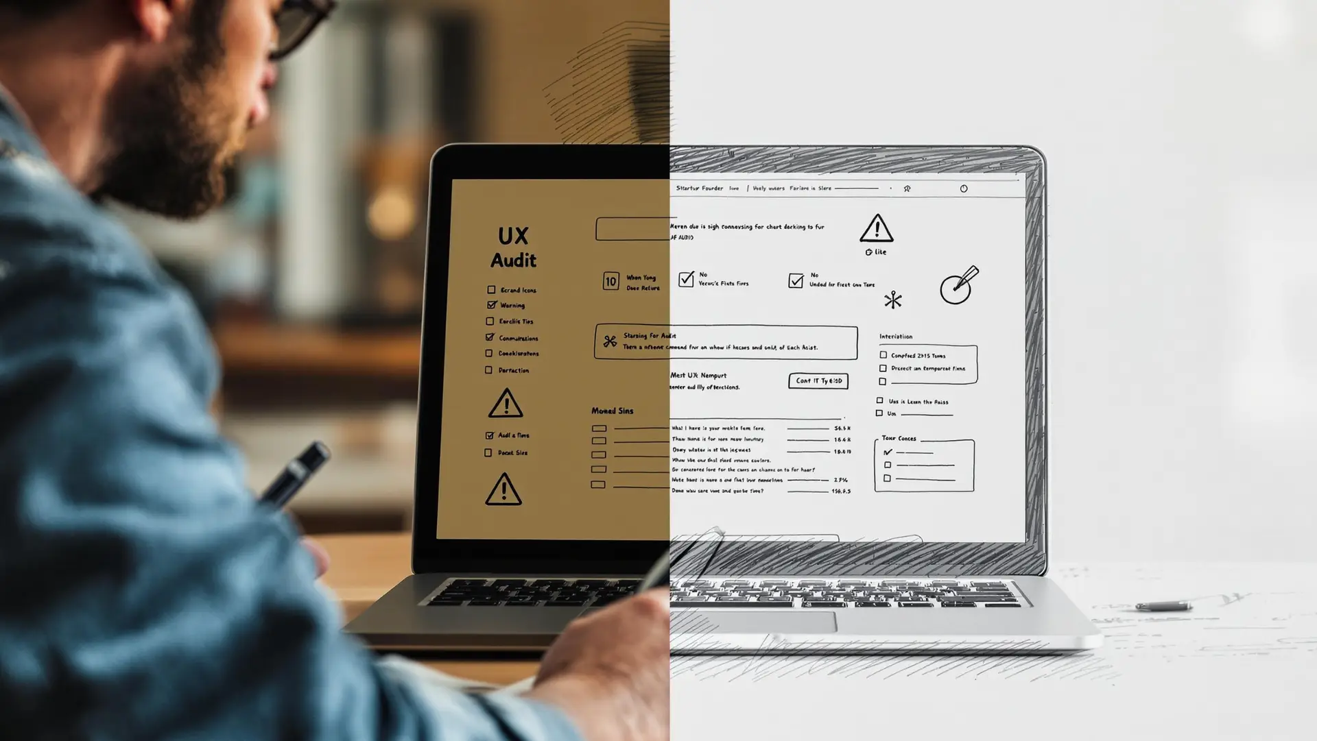
An Honest Homepage UX Audit
A homepage UX audit is one of the fastest ways to figure out why your startup homepage isn’t converting. Founders often obsess over animations, aesthetic trends, or clever taglines but forget to answer the one question that actually matters:
What do you do, who is it for, and why should anyone care?
Your homepage isn’t just a design showcase, it’s your pitch, your proof, and your first shot at conversion. If it’s not working, growth stalls.
In this post, we’ll break down the most common mistakes we uncover during a homepage UX audit and how to fix them before they cost you leads.
1. It Looks Good But Says Nothing
A lot of homepages look like award submissions, not businesses. You scroll, you admire, you leave, because there’s no clear message.
Your hero section needs to punch.
Checklist:
- One-liner that actually says what you do
- Target audience is implied or stated
- Core benefit is obvious
If someone has to scroll to figure out what your product is… it’s too late.
2. The Hero Section is a Vague Mess
“Empowering scalable growth infrastructure for tomorrow’s enterprises” means nothing.
Avoid buzzwords, corporate filler, and CTAs like “Learn More.”
Fix it with:
- Clear, strong headline
- Support sentence with one key benefit
One primary CTA (“Try for free”, “Book a demo”, etc.)
3. No Trust Signals = No Trust
We get it. You just launched. But that’s no excuse to launch without social proof.
What to include:
- Logos of customers, even if small
- Testimonials (yes, even 1–2 help)
- Ratings, press mentions, recognitions
Buyers check who else trusts you. Make that decision easier.
4. Navigation Is a Dead End
Your top nav shouldn’t be a brain teaser. It should guide users through a journey.
Common fails:
- Too many links
- Generic dropdowns
- No clear path to action
Smart nav = simple, structured, focused on action (Start Free, Schedule Demo, etc.)
5. Still Not Mobile-First?
Over 70% of your traffic is mobile. Yet we still audit sites where the homepage breaks completely on small screens.
Mobile-first isn’t optional.
- Is the headline readable?
- Is the CTA tappable?
- Do key visuals load fast?
Bonus: Google indexes mobile first therefore sloppy mobile design affects your SEO.
How to Spot What’s Actually Broken: Heuristic UX Audits
- Some issues are obvious. Others are subtle like unnecessary friction, inconsistent UI cues, or invisible roadblocks.
- We audit using heuristic principles: clarity, consistency, visibility of system status, and minimal cognitive load. If it sounds technical, it is but it’s also what separates “looks good” from “works great.”
- Run your homepage through this lens, and you’ll catch things a visual review never would.
Real Data Doesn’t Lie: Use Heatmaps & Scroll Depth
You can’t fix what you don’t track. Real audits don’t just guess, they use tools like Hotjar, Contentsquare, or FullStory to see:
- Where users click vs. where you want them to
- How far they scroll
- What sections get ignored completely
Your homepage isn’t about what you like, it’s about what works. Let the data call the shots.
Quick UX Audit Checklist
Give your homepage a 2-minute health check:
• Clear hero headline
• CTA above the fold
• Messaging tailored to one target audience
• Social proof visible
• Navigation that guides (not distracts)
• Mobile layout works perfectly
• Scroll depth shows engagement
• Heatmaps align with user intent
If you checked fewer than 6, call us.
What We Recommend at Silver Edie
When we build homepages, we don’t guess – we test.
- Start with the core value: what you do + for whom + benefit.
- Remove friction: no dead ends, no confusion.
- Prioritize above-the-fold clarity.
- Use real copy, real structure, and real UX decisions.
- Pair design decisions with data: clicks, scrolls, drop-offs.
We’ve audited, rebuilt, and redesigned more startup homepages than we can count. And 9 times out of 10, the same issues show up.
Let’s fix yours before they cost you leads.
Final Thoughts
Your homepage is not a poster. It’s a sales asset.
It should earn attention, build trust, and move visitors to act.
Design is part of it. But clarity is everything.
Make it speak. Make it convert. And if it’s not doing either – let’s talk.

Ready to level up? Let’s chat!
#TheEdieEffect


